Circe
A is for · Émilie Rigaud
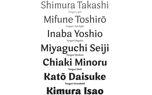
A 14-style type family by Émilie Rigaud, split across Text and Display optical sizes, with seven weights inspired by the seven samurai of Kurosawa.
About
Designed by Émilie Rigaud at French foundry A is for, Tongari takes its name from the Japanese word for 'sharp-pointed', a quality reflected in its letterforms. The family runs across two optical subfamilies, Tongari Text and Tongari Display, each offering seven weights from Light to Black with matching italics. The concept ties each weight to one of the seven samurai from Kurosawa's film, giving the family a coherent thematic identity alongside its typographic range.
Classification
The sharp, pointed forms suggested by the name and samurai reference point to a humanist sans design with distinctive terminals; the dual Text and Display optical sizes reinforce a well-considered type family structure.