 MegaMegaTypeType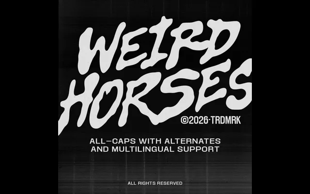
A single-weight hand-drawn display face from The Native Saint Club, built around raw irregular letterforms and deliberate sketchbook energy aimed at gig posters and streetwear graphics.
About
Weird Horses leans into imperfection as its main feature – bold strokes, uneven letter construction and forms that read as pulled from a wall rather than assembled on a grid. At 369 glyphs it covers uppercase letters, diacritics, numerals, punctuation, currency and maths symbols, with two stylistic sets and alternates providing some variation within the single weight. The target contexts are deliberately narrow: gig posters, merch graphics and music visuals where handmade texture is the point.
Classification
Single-weight hand-drawn display face with irregular letterforms, uneven strokes and a raw sketchbook aesthetic. No constructed or geometric logic – the design is entirely driven by expressive, loose mark-making. 369 glyphs with two stylistic sets and alternates give some variation within the one weight.