 MegaMegaTypeType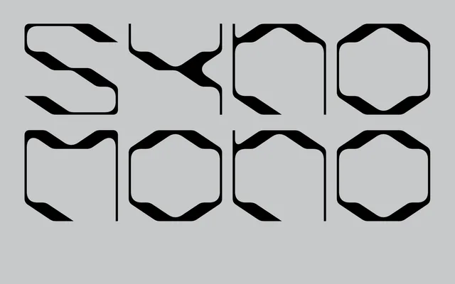
A monospaced display typeface by Vienna-based designer Lukas Haider, available in two cuts and loaded with alternates that play the tension between organic form and mechanical rigidity.
About
SYNO MONO pairs strict monospacing with an expressive display sensibility, offering two distinct styles and 175 glyphs including multiple character alternates. The design sets fluid, humanist stroke qualities against the hard grid of a fixed-width system. It suits editorial headlines, logotypes and type-led graphic work where character takes priority over functional legibility.
Classification
Monospaced display typeface in two named cuts (SYNO MONO-I and SYNO MONO-2). 175 glyphs including uppercase, lowercase, figures, basic punctuation and multiple alternates. Aesthetic sits at the crossover between organic humanist form and rigid mechanical structure. No italic or condensed variants listed.