 MegaMegaTypeType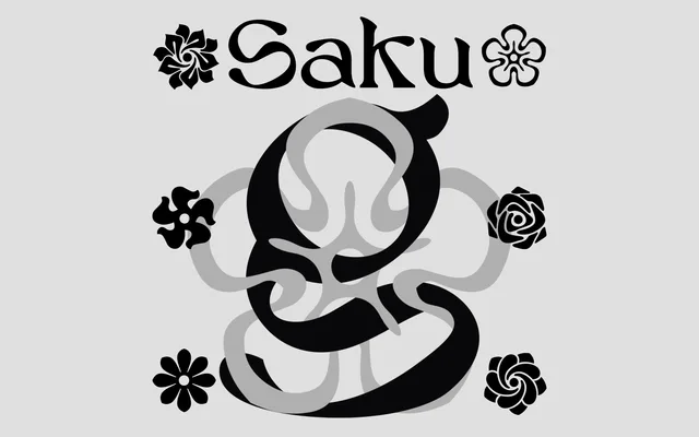
A single-weight warm serif by Peter Roeleveld, designed for gravestone lettering and carrying its softened forms well into decorative display use.
About
Saku was conceived for memorial stonecutting, with soft serifs intended to bring warmth to names carved in cold stone. The design translates to decorative display contexts, backed by 430 glyphs, ligatures and four stylistic sets. It ships as a single Roman cut with no italic, condensed or mono companion.
Classification
Warm display serif with softened forms, originally designed for gravestone lettering. Single weight, no italic or condensed. Four stylistic sets and ligatures included. Latin European glyph coverage with diacritics.
Weights
Regular
Languages
EnglishFrenchGermanSpanishItalianPortugueseDutchPolishCzechDanishSwedishNorwegianFinnish
Tags
serifdecorativememorialgravestonewarmdisplaysingle-weightligaturesstylistic-sets