 MegaMegaTypeType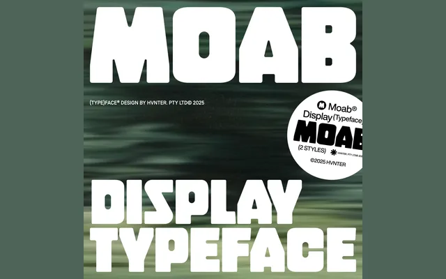
A chunky, uppercase-only display face in two style variants, built for logos and branding with a Y2K-inflected boxy character.
About
Moab Display is a bold, boxy sans-serif built for high-impact graphic work. It ships in two style variants that alter the counters and shoulders of letters, covering 218 glyphs across uppercase characters, numerals and basic punctuation. There is no lowercase, and versatility is not the point – this is a personality-led face for identity work and editorial display use.
Classification
Uppercase-only bold display sans-serif with two style variants that alter counters and shoulders. No lowercase, no italic, no condensed. Y2K-inflected boxy/bubble aesthetic. Two styles are separate font files rather than weight variations.
Weights
Style 1Style 2
Languages
Latin
Tags
displaybolduppercase onlyY2Kboxybubblebrandinglogoindie