 MegaMegaTypeType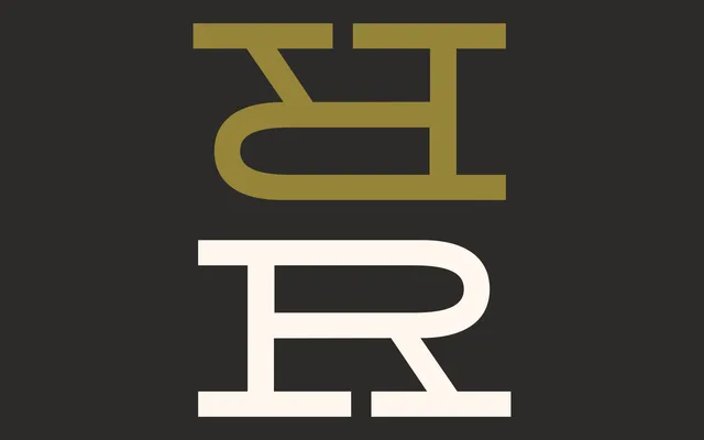
A fixed-width display serif built for equestrian contexts, pairing strict rectilinear serifs with rounded letterforms to produce something upright and a little haughty.
About
Cavale V.2 is a single-weight display typeface by Valentin Normand, conceived around equestrian sport. Its defining tension is structural: strict vertical and horizontal serifs set against rounded, curved letterforms – rigour and softness held in balance. At 202 glyphs it covers standard Latin alongside punctuation, currency and mathematical symbols, available in OTF and web formats.
Classification
Single-weight display serif with strict rectilinear (vertical and horizontal) serifs set against rounded letterforms. Described as fixed-width in character. Geometric contrast construction; themed around equestrian sport. No italics, no condensed, no additional weights.