 MegaMegaTypeType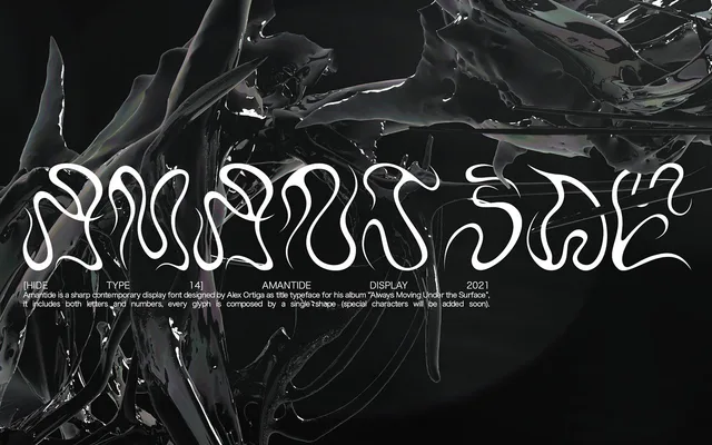
A single-weight geometric display face with uppercase letters and numerals only, built from one abstract form for bold, aggressive headlines.
About
Amantide was created by Alex Ortiga as title typography for his music album, which shows in its singular, uncompromising aesthetic. Every glyph derives from one abstract geometric shape, producing a bold visual rhythm suited to large-scale display work. With only 36 glyphs – uppercase letters and numbers – it is strictly a headline tool with no lowercase, no italic and no text-setting utility.
Classification
Single-weight geometric display face built from one abstract shape repeated across all glyphs. Uppercase letters and numerals only – 36 glyphs total. No lowercase, italic, condensed or mono variants. Aggressively styled, clearly intended for large-scale headline use.