 MegaMegaTypeType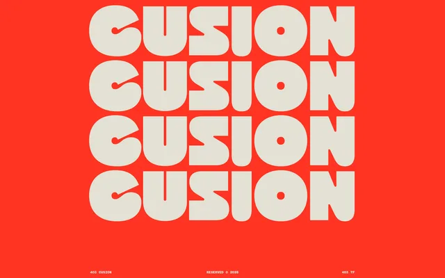
A chunky 1970s retro display face from 403TF, built on soft, rounded letterforms inspired by vintage upholstery and period advertising confidence.
About
403 Cusion channels the visual language of 1970s advertising through thick, plush letterforms that feel almost tactile – rounded to the point of looking inflated, with none of the austerity of contemporary type. Two styles ship: Regular and Slant. The 732-glyph set covers alternates, ligatures, three numeral styles and extended punctuation, making it more considered than a typical novelty display release. It suits headlines, packaging, apparel and branding where a warm, retro optimism is the brief.
Classification
Rounded, bulbous display type with no serifs and a distinctly inflated, "stuffed" quality to every stroke. Draws directly from 1970s advertising lettering – thick, soft curves, no harsh angles, optimistic in tone. Closer to groovy American photo-lettering of the period than geometric sans-serif.