 MegaMegaTypeType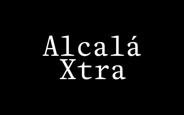
Damien Gautier's 31-year text serif project, rooted in the Complutensian Polyglot Bible, reissued in 2026 with a taller x-height and Mono and Stencil companions designed for press and editorial work at small sizes.
About
Alcalá Xtra is the small-text edition of Gautier's historical family, first sketched in 1995 from type in the Complutensian Polyglot Bible and now in its fourth iteration. The enhanced x-height makes it appear visually larger than its point size, a genuine advantage at the sizes typical in newspaper and magazine composition. Five styles – Roman, Italic, Bold, Mono and Stencil – form a tight, purposeful toolkit: the Mono for rhythmic editorial grids, the Stencil for identity and signage, the text styles for sustained reading.
Classification
Renaissance-rooted text serif drawing on type from the Complutensian Polyglot Bible (1520). Alcalá Xtra is the small-size-optimised edition of Gautier's parent Alcalá family, distinguished by a more generous x-height that makes it read visually larger than its nominal point size. Five focused styles – Roman, Italic, Bold, Mono and Stencil – each address a distinct function: the Mono introduces fixed-width rhythm for editorial layouts; the Stencil extends the design to identity and signage at varied scales. No intermediate weights; the family is deliberately lean.